If you’ve ever opened a Power Apps model-driven app for the first time, the interface can feel overwhelming. Unlike canvas apps — where you design every pixel — model-driven apps give you a structured, data-centric UI that is generated for you based on your Dataverse tables, forms, and views. Once you understand the anatomy of that UI, everything clicks into place.
This post is your guided tour. We’ll walk through every major UI element — from the command bar at the top to the area switcher at the bottom of the left navigation — using a Sales Hub-style app as our running example.
What is a model-driven app?
A model-driven app is built on top of Microsoft Dataverse (the cloud database underpinning the Power Platform). Instead of designing the UI from scratch, you define:
- Which tables (Entities) the app should expose (e.g. Accounts, Contacts, Leads)
- Which views show lists of records from those tables
- Which forms display the details of a single record
- How the navigation is structured (areas, groups, sub-areas)
The Power Platform engine then assembles the UI automatically. This makes model-driven apps ideal for complex, data-rich business scenarios like CRM, case management, or field service — anywhere you need consistent, role-based access to structured data.
The anatomy of the UI — a bird’s eye view
Every model-driven app shares the same structural skeleton:
| Zone | What it contains |
|---|---|
| Command bar (top) | App name, global search, quick-create button, user settings |
| Left navigation | Sitemap: areas, groups, sub-areas |
| Main content area | Views, forms, dashboards, or custom pages |
| Sub-command bar | Context-sensitive actions for the current record or list |
| Timeline | Activity history on a form (emails, calls, notes, tasks) |
Let’s dive into each zone in detail.
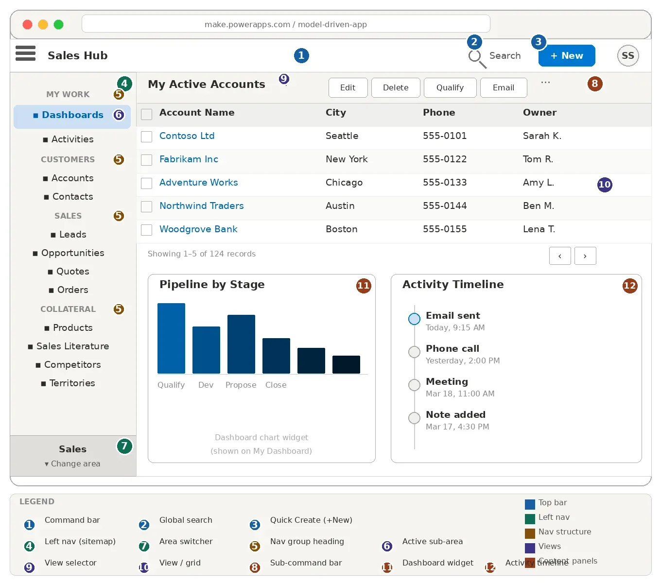
① The command bar
The command bar runs across the very top of the app. It is always visible, regardless of where you are in the app.
Components of the command bar
Hamburger menu / App name On the far left you’ll find the hamburger icon (three horizontal lines) followed by the app name (e.g. Sales Hub). Clicking the hamburger collapses the left navigation pane so you get more horizontal space for the main content area — useful on smaller screens.
Global search (magnifying glass icon) Clicking the search icon opens the Relevance Search or Quick Find bar. You can type any keyword and the app will search across all enabled tables simultaneously — for example, typing “Contoso” will surface matching Accounts, Contacts, and Opportunities all at once. We cover this in more detail in the global search section below.
Quick Create button (+ New)
The + New button (sometimes shown as a + icon) opens a quick-create form — a lightweight side panel that lets you create a new record without navigating away from your current page. For example, you can create a new Lead while you’re looking at a dashboard. Not every table has a quick-create form enabled; an administrator must turn this on per entity.
Settings / gear icon Gives access to personalization options (such as setting your home page) and links to the Power Platform admin center.
User avatar / profile Displays your initials or profile picture. Clicking it reveals your display name, email, and a Sign out option.
② The left navigation pane (sitemap)
The left navigation pane is the sitemap of your app — the blueprint that determines what users can access and how content is organized. It is built in the Power Apps app designer or in the modern sitemap editor.
The sitemap has a three-level hierarchy:
Area
 └── Group
      └── Sub-area (table, dashboard, URL, or custom page)
Areas
An area represents the broadest organizational unit in a model-driven app. Think of it as a “department” or “module”. Larger apps — like Dynamics 365 Sales — ship with multiple areas such as:
- Sales
- Service
- Marketing
- Settings
The area switcher lives at the bottom of the left navigation pane. It shows the currently active area and, when clicked, expands to let you jump to a different area. Each area has its own independent set of groups and sub-areas.
Example: In Sales Hub, switching from the Sales area to the Service area changes the entire left nav — the Sales area shows Leads, Opportunities, and Quotes, while the Service area shows Cases, Queues, and Knowledge Articles.
If your app has only one area, the switcher is hidden and the area label appears as a header above the navigation items.
Groups
Within an area, groups (sometimes called navigation groups) act as section headings inside the left nav. They are not clickable — they exist purely to visually separate related sub-areas.
Example: The Sales area in Sales Hub has groups like My Work, Customers, Sales, and Collateral.
Groups are collapsible in modern model-driven apps, so users can hide sections they don’t use often.
Sub-areas
Sub-areas are the actual navigation items you click. Each sub-area links to one of the following:
| Sub-area type | What opens |
|---|---|
| Table (entity) | The default view for that table (e.g. Accounts opens My Active Accounts) |
| Dashboard | A specific system or personal dashboard |
| URL | Any internal or external web page embedded in the app |
| Custom page | A canvas-app-style page embedded inside the model-driven app |
| Web resource | An HTML/JS web resource |
Example: Clicking Accounts under the Customers group navigates you to the Accounts view. Clicking Dashboards under My Work takes you to the default dashboard.
Sub-areas can optionally display a record count badge next to the label, which is useful for queues or inbox-style views.
③ Views — the list/grid page
When you click a table sub-area (e.g. Accounts), you land on a view — a paginated grid of records from that table, filtered and sorted according to the view definition.
Types of views
| View type | Description |
|---|---|
| Personal view | Created by individual users for themselves; not visible to others by default |
| System view | Created by a developer or admin; available to all users with access |
| Quick Find view | Defines which columns are searched when a user types in the search box on a view page |
| Lookup view | Shown inside a lookup field on a form when a user searches for a related record |
| Associated view | Shown in a sub-grid on a form to display related records |
The view selector
At the top left of the view page, you’ll see the view name (e.g. My Active Accounts) followed by a dropdown chevron (▾). Clicking the chevron reveals the view selector — a list of all available views for that table. Users can switch between views like:
- My Active Accounts (records owned by me)
- All Accounts (all records I can see)
- Inactive Accounts
- Accounts: No Campaign Activities in Last 3 Months
View columns and sorting
Each view displays a set of columns chosen by whoever built the view. You can:
- Click a column header to sort ascending, then again for descending.
- Drag column headers to reorder them (in modern views).
- Resize columns by dragging the column border.
- Personalize the view (add/remove columns) via the column options, if the admin allows it.
Filtering and searching within a view
Above the grid, a search bar (Quick Find) lets you search within the current view. This only searches the columns defined in the Quick Find view for that table.
For more complex filtering, click the filter icon (funnel icon) to open the advanced filter pane, where you can add multiple conditions across any column.
Selecting records and bulk actions
Each row has a checkbox on the left. You can:
- Select one record — checkbox appears on hover.
- Select all on the page — click the header checkbox.
- Select all records in the view — a banner appears after selecting the page, offering to select all.
Once records are selected, the sub-command bar populates with relevant bulk actions (e.g. Delete, Assign, Send Email, Merge, Qualify for Leads).
Pagination and record counts
Below the grid, a pagination bar shows the current page (e.g. 1 – 50 of 1,247 records) and Previous / Next buttons. The default page size is 50 rows; admins can change this via the organization settings (max 250 rows per page).
④ The sub-command bar (ribbon)
The sub-command bar (historically called the ribbon) appears just below the main command bar on every page. It contains context-sensitive actions — the buttons change depending on:
- Whether you are on a view (list) or a form (single record)
- Which table you are working with
- Which records are selected
- Your security role
On a view page
Typical sub-command bar buttons on a view include:
- New — create a new record (opens the main create form, not the quick-create panel)
- Delete — delete selected records (requires confirmation)
- Refresh — reload the grid data
- Email a link — send a link to this view via email
- Run report — launch any SSRS or FetchXML report associated with the table
- Import from Excel / Export to Excel — bulk data operations
- Flow — trigger a Power Automate flow from the selected records
- ··· (More commands) — overflow menu for less frequently used actions
On a form page
When you open a specific record, the sub-command bar shows record-level actions:
- Save / Save & Close / Save & New
- Delete
- Deactivate / Activate
- Assign (change the owner)
- Share
- Process-specific actions — e.g. on a Lead form: Qualify, Disqualify; on an Opportunity form: Close as Won, Close as Lost
Administrators and developers can add custom buttons to the command bar using the Power Apps command designer (or the classic Ribbon Workbench tool), which can trigger Power Automate flows, JavaScript, or URLs.
⑤ Forms — the record detail page
When you click a record in a view (e.g. click Contoso Ltd in the Accounts grid), the app navigates to that record’s form — the page that displays all the fields and related data for a single record.
Types of forms
| Form type | Purpose |
|---|---|
| Main form | The primary form opened when navigating to a record |
| Quick Create form | A simplified form shown in the side panel (triggered by + New) |
| Quick View form | A read-only summary embedded inside another record’s form (via a quick view control) |
| Card form | A compact layout used in sub-grids and activity walls |
Form anatomy
A main form is organized into the following layers:
Header The header displays key fields at the very top of the form — typically the record name and a few critical status fields. Header fields are always visible even when you scroll down. Developers control which fields appear in the header.
Business process flow (BPF) Directly below the header, many forms display a Business Process Flow — a visual pipeline of stages (e.g. Qualify → Develop → Propose → Close). Each stage contains a set of required or recommended fields. You click a stage to expand it, fill in the fields, and then click Next Stage to advance the record through the process. The BPF is a guided experience to ensure data quality at each step.
Example: The Lead-to-Opportunity Sales Process BPF walks sales reps through Lead Qualification, Opportunity Development, Proposal, and Close stages.
Tabs Forms are divided into tabs (horizontal tabs across the top of the form body). Each tab contains one or more sections. Common tabs on an Account form:
- Summary — name, contact info, key details
- Details — industry, annual revenue, number of employees
- Related — sub-grids for Contacts, Opportunities, Cases
- Timeline — activity history
Sections Within a tab, sections group related fields together. A section has a label (e.g. Contact Information) and can have one or two columns of fields.
Fields Fields are the individual data inputs on a form. Field types include:
- Text (single line, multi-line)
- Number (whole number, decimal, currency)
- Date/time
- Option set (a single-select dropdown backed by a Dataverse choice column)
- Multi-select option set (checkboxes)
- Lookup (a reference to another table — e.g. the Account field on a Contact)
- Boolean (two-option toggle)
- File / Image
- Customer (polymorphic lookup to Account or Contact)
Fields can be required, recommended (shown with a blue asterisk), or optional. Business rules and JavaScript can make fields visible/hidden or required/read-only dynamically.
Sub-grids Sub-grids appear within form tabs to show related records. For example, the Contacts sub-grid on an Account form shows all Contacts that belong to that Account. You can create new related records directly from a sub-grid without leaving the parent form.
⑥ The timeline
The timeline is a special control that appears on most main forms (Accounts, Contacts, Leads, Opportunities, Cases, etc.). It provides a chronological activity history for the record.
What appears in the timeline?
- Emails — sent to or received from this record’s contacts
- Phone calls — logged calls
- Tasks — to-do items linked to this record
- Appointments / Meetings
- Notes — freeform text notes with optional file attachments
- Custom activities — any custom activity table created in Dataverse
Each entry shows the activity type, subject, who created it, and the date/time. You can expand an activity to see its full details inline.
Adding a new activity from the timeline
At the top of the timeline there is a + (Add activity) button and a filter bar. Clicking + lets you quickly log:
- A note
- A task
- An email (opens a compose window)
- A phone call
- An appointment
You can also filter the timeline by activity type, date range, or whether the activity is open or closed.
Timeline vs. activities sub-grid
The timeline is great for a chronological view of communication history. If you need to manage and filter activities as a grid (with sortable columns and bulk actions), use the Activities sub-area in the left navigation instead.
⑦ Dashboards
Dashboards aggregate data from multiple tables into a single page of charts, lists, and KPI tiles. They are the first thing many users see when they open an app (if Dashboards is the default sub-area).
Types of dashboards
| Type | Created by | Visible to |
|---|---|---|
| System dashboard | Developer / admin | All users with access |
| Personal dashboard | Individual user | Only that user (unless shared) |
| Interactive dashboard | Developer / admin | All users; has drill-down filters |
Dashboard components
Dashboards are composed of components arranged in a grid layout (typically 1, 2, or 3 columns):
- Charts — bar, column, line, pie, funnel, donut charts drawn from a Dataverse view
- Lists — a view-based grid showing records (same as a view page, but smaller)
- IFrame — an embedded web page
- Web resource — an HTML/JS component
Interactive dashboards
Interactive dashboards are a premium experience. They feature:
- Global filters at the top — filter all components simultaneously by Owner, Date Range, etc.
- Stream (vertical scrolling list) on one side
- Charts on the other side
- Drill-down — clicking a chart segment filters the stream to matching records
Example: An interactive dashboard for Case Management might show open cases filtered by priority, with a donut chart for status distribution and a stream of the oldest open cases.
Switching dashboards
On the dashboard page, the view selector (dropdown at the top) lets you switch between available dashboards. The Set as Default option in the sub-command bar pins a specific dashboard as your home view.
⑧ Global search
Model-driven apps offer two search mechanisms:
Dataverse search (Relevance Search)
The primary, recommended search. When you click the magnifying glass icon in the command bar and type a query:
- It searches across all enabled tables simultaneously.
- Results are ranked by relevance using an Azure Cognitive Search index.
- Results are grouped by table (Accounts, Contacts, Leads, etc.).
- You can click a result to open the record, or click See all results for Accounts to see a full filtered view.
Dataverse search must be enabled by an administrator at the environment level, and each table must be opted in individually.
Quick Find (legacy search)
If Dataverse search is disabled, you’ll see a search box at the top of each view page. This Quick Find search only looks within the current table and only searches the columns defined in the table’s Quick Find view.
⑨ Quick Create forms
The + New button in the command bar opens a Quick Create panel that slides in from the right — overlaying the current page rather than navigating away from it. This is ideal for capturing data rapidly without losing your current context.
A quick-create form is a stripped-down version of the main form. It shows only the most essential fields and has no tabs, sub-grids, or timeline. Once you save the quick-create form, the panel closes and you return to what you were doing.
Tip: Not all tables have quick-create enabled. Admins enable or disable this on a per-table basis in the table settings in the Power Apps maker portal.
⑩ Business process flows (BPF)
We touched on BPFs in the forms section, but they deserve a fuller description. A Business Process Flow is a visual guide that appears at the top of a form, representing the stages a record must move through to be considered complete or successfully closed.
Key BPF concepts
- Stages — the major steps (e.g. Qualify, Develop, Propose, Close)
- Steps — fields inside a stage that a user should fill in
- Required steps — must be completed before the user can advance to the next stage
- Active stage — the stage the record is currently in, shown highlighted
- Branching — BPFs can branch conditionally (e.g. different paths for different customer segments)
Switching processes
A record can have multiple process flows available. A Process button (or Switch Process in the sub-command bar) lets a user change which BPF is applied to the record. For example, a Lead might support both a Lead to Opportunity Sales Process and a Simplified Lead Process.
Putting it all together — a typical user journey
Here is what a day-in-the-life workflow looks like in a Sales Hub model-driven app:
- User opens the app → lands on the My Dashboard (default sub-area under My Work).
- Spots an overdue task in a dashboard list → clicks the record to open the Opportunity form.
- Reviews the Business Process Flow → sees the opportunity is in the Propose stage.
- Scrolls to the Timeline → reads a previous email thread for context.
- Clicks + New in the Timeline → logs a phone call note.
- Fills in proposal details in the Details tab → clicks Save.
- Clicks Close as Won in the sub-command bar → marks the opportunity as closed/won.
- Clicks the Accounts sub-area in the left nav → lands on the My Active Accounts view.
- Searches for a customer using the Quick Find box in the view.
- Clicks + New in the command bar → fills a quick-create Lead form for a new prospect.
Summary table — UI components at a glance
| Component | Where | Purpose |
|---|---|---|
| Command bar | Top of every page | App name, global search, + New, user settings |
| Left nav (sitemap) | Left side | Areas → Groups → Sub-areas |
| Area switcher | Bottom of left nav | Switch between app modules/departments |
| Sub-command bar | Below command bar | Context-sensitive actions for current page |
| View (grid) | Main area when table sub-area clicked | Paginated list of records |
| View selector | Top of view | Switch between different filtered/sorted views |
| Quick Find | Top of view | Search within the current table |
| Main form | Main area when record clicked | All fields, tabs, sections for one record |
| Header | Top of form | Key fields always visible while scrolling |
| Business Process Flow | Below header on form | Stage-by-stage guided data entry |
| Tabs | Form body | Organize sections of a form |
| Sub-grid | Inside a form tab | Related records from another table |
| Timeline | Usually on a Summary tab | Chronological activity history |
| Dashboard | Main area for dashboard sub-areas | Charts, lists, and KPIs |
| Interactive dashboard | As above | Filterable, drill-down dashboard |
| Quick Create panel | Slides in from right (+ New) | Fast record creation without navigation |
| Global search | Command bar icon | Cross-table relevance search |
What’s next?
Here are some natural next steps:
- Build your first model-driven app — use the Power Apps maker portal at make.powerapps.com to create a table, add a view and form, and wire up a sitemap.
- Customize forms — learn how to add, remove, and reorder fields and sections in the form designer.
- Create views — explore FetchXML-based filtering to build views that surface exactly the right records.
- Build a dashboard — add charts linked to your views and set one as the app default.
- Design a BPF — define the stages and required steps that guide your users through a business process.